Package Carousel
UX Research | UX/UI Design
Background
The goal of this project was to improve the usability of an ecommerce page selling protection plans. After a successful redesign, the page had seen a significant increase in conversion. However, while performing routine user testing, we discovered there was still room for improvement. The use of a carousel to display packages was intended to reduce scrolling, but we found that some users were struggling to navigate the page. Together, my team and I ideated and tested a series of design updates to improve the usability of the package carousel, particularly on mobile.
Please note that all branding and final designs have been removed from this project for privacy reasons.
Initial Updates
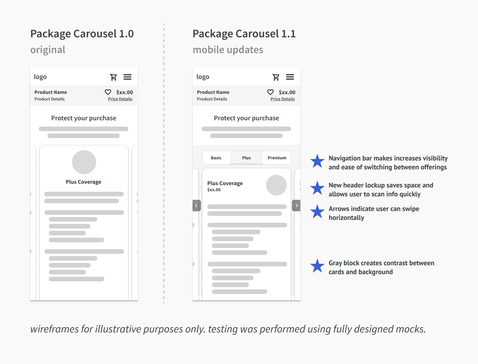
Usability issues with the carousel were discovered during user testing for another initiative. We noticed that several users failed to scroll left or right, or realize that the packages were part of a carousel at all. Realizing that this was a major problem, we made some immediate UI updates. The background was changed from white to gray, in order to increase contrast and make the package cards stand out. Additionally, sticky arrows were added to either side of the screen, indicating to users that they could scroll horizontally. These updates were implemented immediately.
Next, we performed a competitive analysis to see how other companies were presented package options, looking at sites like Hulu and Xfinity before coming back to ideate more broadly on our own problem. We made several more changes to our design, including rearranging the information at the top of each card to save space, and adding a set of tabs above the carousel. The tabs proved particularly successful in testing - many users chose to use them exclusively while navigating.
;)
Rethinking Package Cards
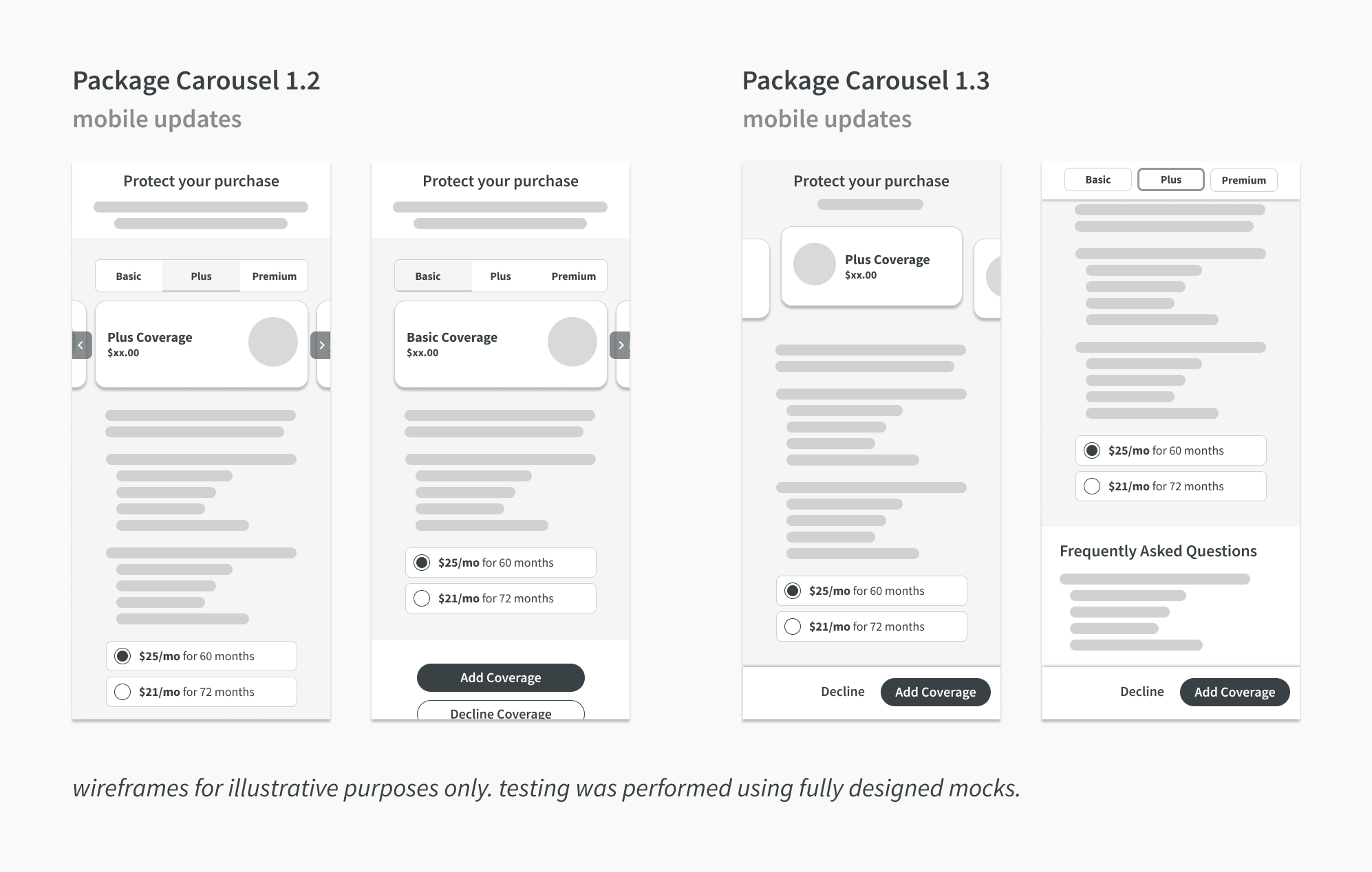
A less-critical but ongoing issue with the package cards was the fact that they contained so much content, and often didn't fit in the viewport. Often, the most premium package would contain two or three times the amount of information that the basic package did - but both package cards ended up being the same height, which resulted in a lot of white space on the basic package. In an attempt to solve this issue, we created a "mini-card" design, in which only the package name, price, and icon were contained within the card. The appropriate package details and term length were then populated below. This approach received a lot of positive feedback from stakeholders, but was ultimately put on pause while the business focused on other priorities.
Six months later, we picked these designs back up, and I worked with a teammate to refine them, exploring issues like what happens if the user scrolls and the mini-cards are no longer visible. My teammate created a mobile prototype, and then we began testing it.
;)
Testing
We performed two rounds of unmoderated testing. In the first round, we tested with six different users for basic usability issues, and found very few. Users navigated the prototype with ease, and understand intuitively how the carousel worked.
In our second round of testing, we performed a balanced comparison test between the new version of the page and the version that was currently live. Although the old version performed fine, the new version had consistently higher SEQ scores when it came to ease of navigation, users' readiness to make a decision, and their likelihood of purchasing a protection plan.