OfferSmart
Rapid Iteration | User Testing
Background
Putting in an offer on a home can be a nerve-wracking process. In order to avoid having an offer rejected, it is up to real estate agents to educate their clients, so that clients can make an appropriate offer. However, walking buyers through the offer process can be time-consuming - especially for for an agent who's busy running from tour to tour.
The goal of OfferSmart was to find a more efficient way to help buyers understand how much they should offer for a home. As the designer on this project, I collaborated with several real estate agents, as well as members of our Creative and Product teams, to devise a solution.
;)
;)
Research
We began our design sprint by mapping out the entire home buying process and identifying common pain points. There were several common issues that came with putting in an offer:
- Buyers don't know how much to offer, and need agents to educate them
- Agents have to manage buyer expectations so that buyers aren't blindsided if their offer is rejected
- Agents may struggle to write up an offer as quickly as possible if they are out touring with other clients
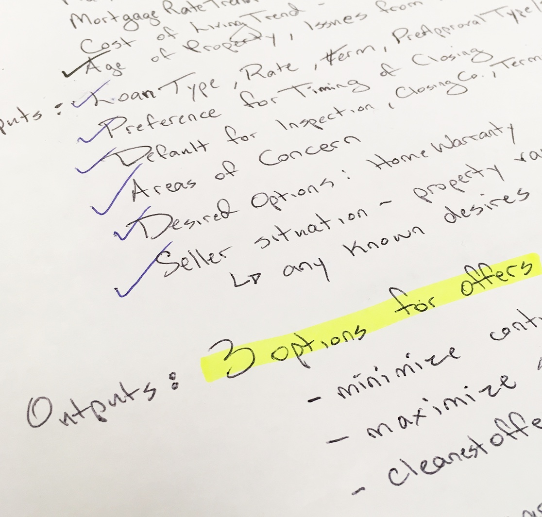
We determined that we could make our agents' lives easier by streamlining the education/expectation-setting process as much as possible. Creating clear, consistent educational resources would reduce the amount of time required to help each buyer determine their ideal offer amount, and could increase offer quality, thereby increasing the number of offers that are ultimately accepted. As we brainstormed how to educate buyers, we worked with the agents on our team to make a list of factors that could influence what a buyer decides to offer.
;)
Ideation
After gathering the necessary research, we created storyboards to explore different ideas for transmitting offer-related information to clients. We ended up combining several ideas as we narrowed down our options. Our eventual solution was to bring buyers to a webpage that used visuals to educate users about current market conditions, and showed them their agent's "recommended" offer amount.
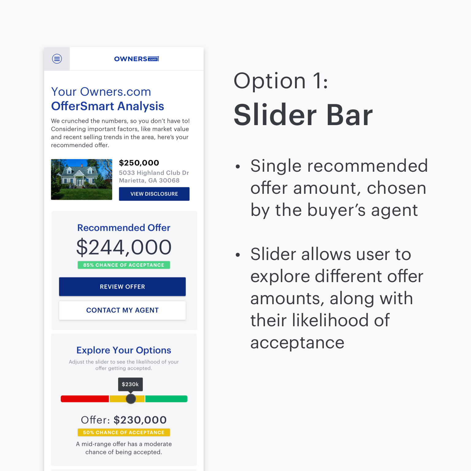
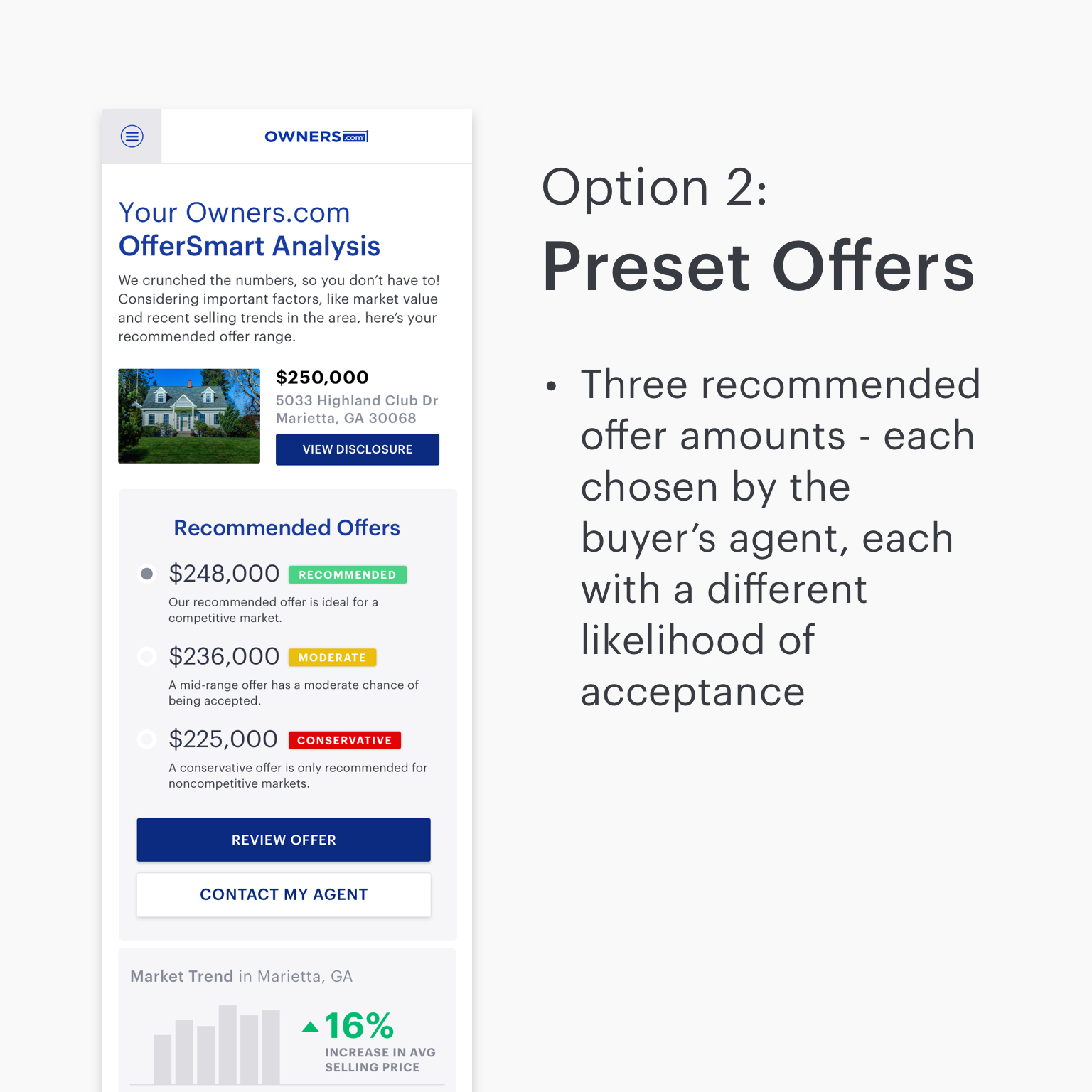
As we began designing out a prototype, we ended up with two different versions of the "Recommended Offer" module. The first version included a slider bar, which allowed users to explore different offer amounts and view their likelihood of acceptance for each amount. The second version showed three different offer amounts - ranging from a safer, higher offer to a riskier "lowball" offer. We hypothesized that giving the user three preset offer amounts would be simpler and less stressful than allowing them to play with the slider, and possibly overwhelming them with the weight of their decision. In order to explore this hypothesis, we did some user testing.
;)
;)
User Testing
We tested these two concepts with five users between the ages of 25 and 65, all current or recent homebuyers. We found that three out of five users preferred Option 1. These users appreciated the ability to see how increasing or decreasing their offer would affect their chances of getting accepted. The two users who preferred Option 2 said that the three preset offers were "more helpful", and "easier" - overall, they seemed more content to take the agent recommendations, rather than playing with the numbers on their own. Going forward, we would need to test with a larger number of users, as well as specific personas, as different types of buyers might prefer different designs (i.e. first time homebuyers).
In terms of the market comparison data (located beneath the offer recommendations), four out of five users asked for more information. For this prototype, we tried to include as little information as possible, displaying only three different data points, so as not to overwhelm the user. Going forward, we would increase the amount of data that is shown, and perform more user testing to see what data users really rely on to choose their offer amount.